STOCKLEY'S
CHALLENGE
Stockley’s had gained a listing in Iceland for a range of 23 classic sweets, the kind of sweets that have been around for generations and have stood the test of time. Although this range was to come under the Stockley’s brand they wanted it to be a bespoke design, that had huge impact on shelf, and would appeal to customers of all ages.
During our briefing session we discussed substrates and finishes, also a window was mentioned so that customers could see the familiar sweets inside. Although this range was initially being printed digitally on ProAmpac’s HP Indigo 20000 we were also asked to consider how the design might work when printed conventionally on a flexo press so that it was future proof if/when quantities increased.
RESPONSE
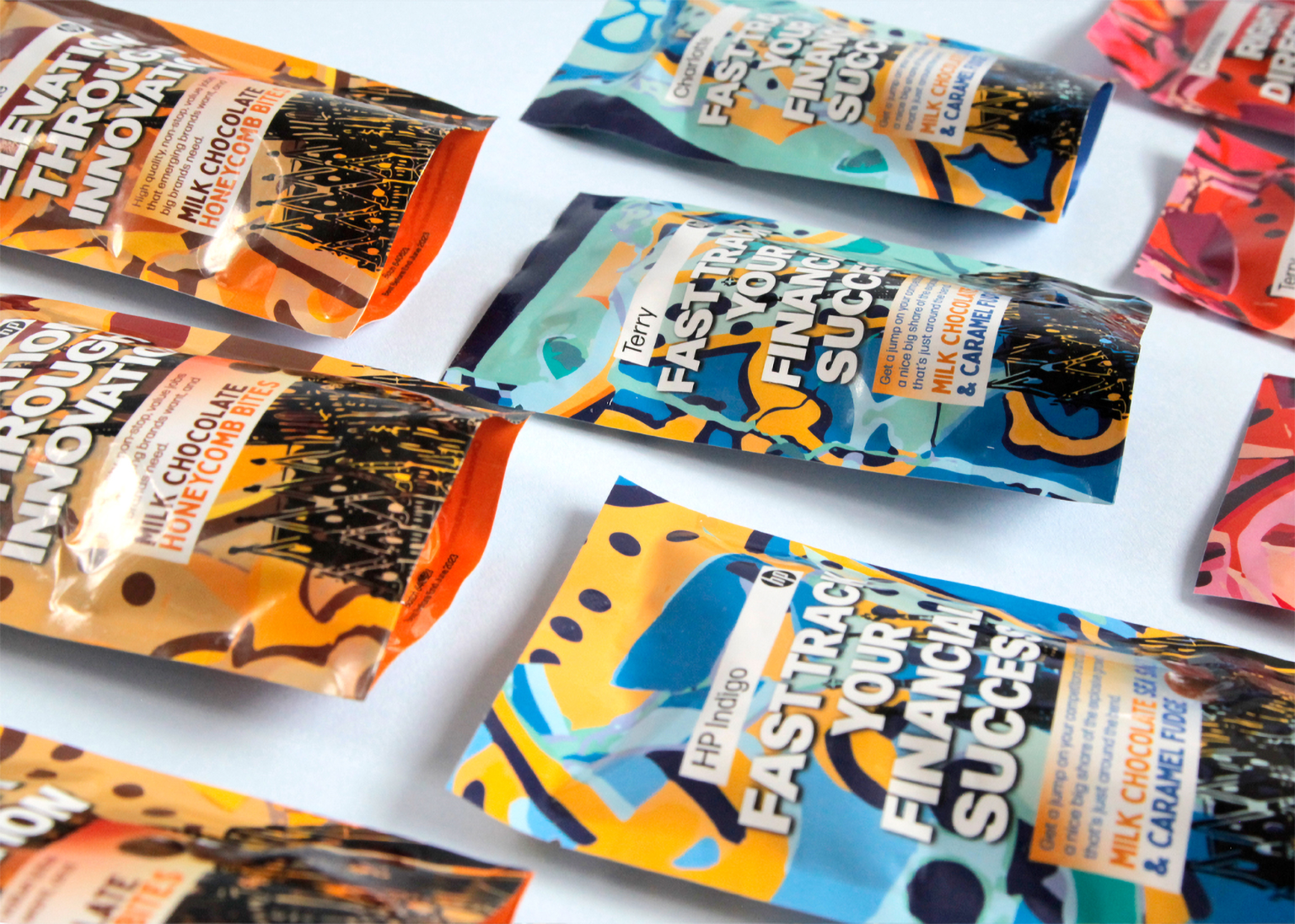
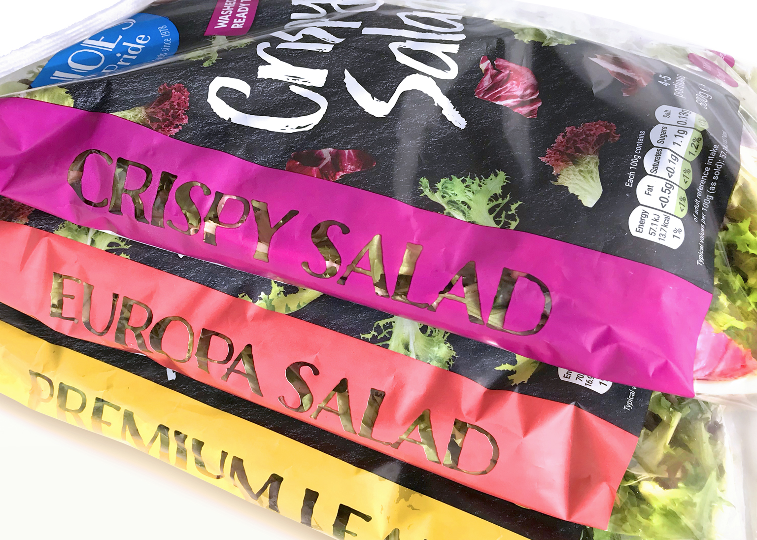
We decided early on, that colour was going to be a key player in getting the sweets to stand out. These are far from boring products!
After presenting three very different but colourful design routes using 3D models to bring them to life, one route emerged as a clear winner.
Our solution was to use lively colours that reflected the flavour of the sweets, and unique typography for the product titles that played on the character of the spogs (what we Yorkshire folk used to call sweets back in the day). We used these varied typefaces as initials to make individual window shapes. If that's not enough, we also designed some colourful patterns, unique to each flavour running along the seals top and bottom.
The final piece of the puzzle was to cheekily take the Stockley's logo and create a new stamp-like device. This separated it nicely from the variety of titles and provided an anchor of consistency to hold the range together. Job done!
RESPONSE
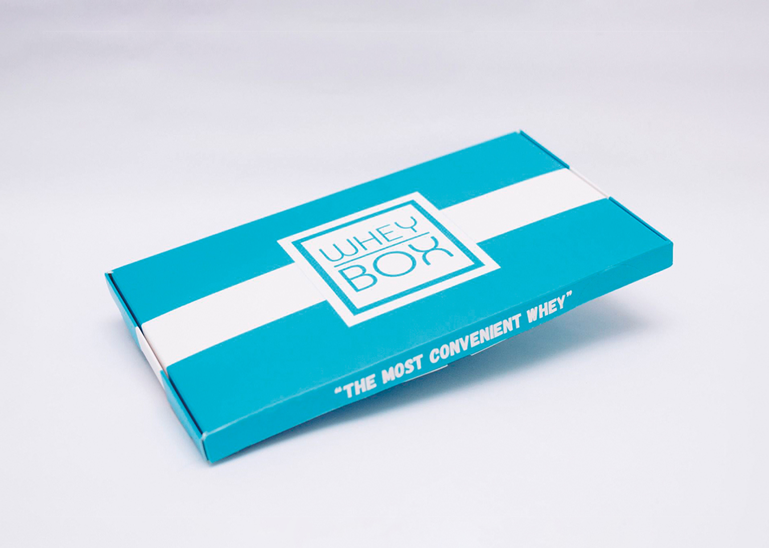
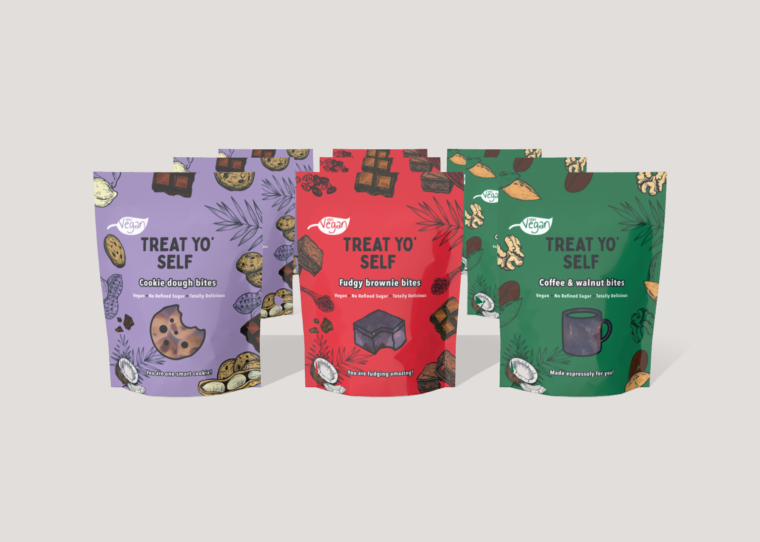
Our first step was to meet with Niamh, founder of Treat Yo' Self Food Ltd and explain exactly why the printers had rejected their packaging. Needless to say the list was long; unlicensed stock imagery, poor quality illustrations, far too many colours, incorrect dimensions, unscannable barcodes etc... to name a few.
Working together we were able to quickly correct the designs, bringing them up to standard and at the same time offer significant improvements, including the addition of Hero Images for e-commerce.
"proper! are one of the best companies we have ever worked with. They were recommended to us and we can see why. Dan and Terry are friendly and professional. They think of every last detail, make amazing recommendations that truly bring your design to life. They also work great with third parties so we didn’t have to worry about being the middleman. If you are looking for the best designers then this truly is the company to work with. Thanks Dan and Terry for everything!”
Request a Proper! briefing form
Not sure where to start? or which questions to ask? Don't stress, we've done the hard work for you!... Rest assured that we will process the personal data you have supplied in accordance with our privacy policy.