a heritage of snack branding
branding
Packaging design
artwork
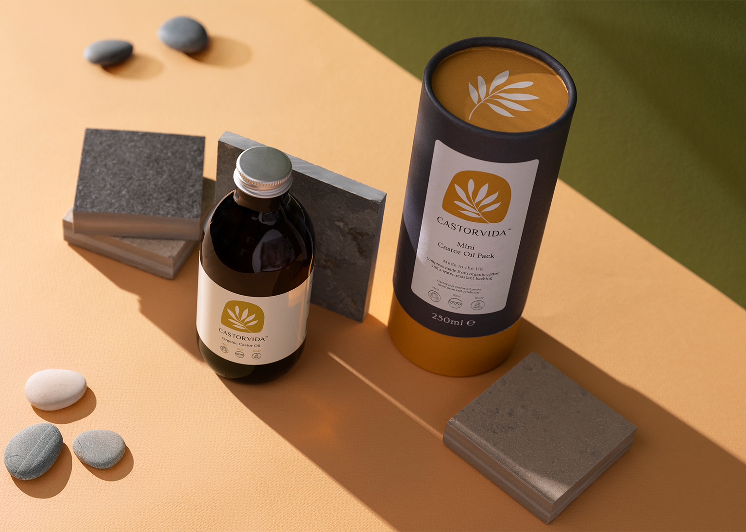
Mackie's® of Scotland.
Mackies® of Scotland.
A Design Journey
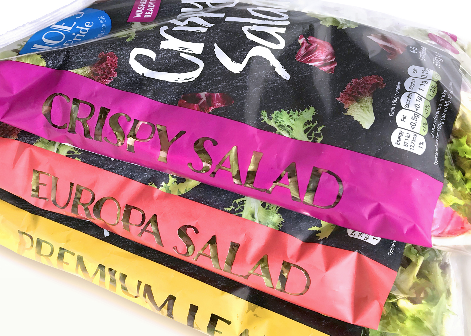
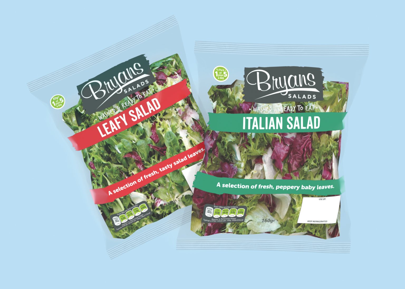
From Welsh Crisps to Popcorn.
Mackie’s® crisps are getting a new name, but our design studio recalls fondly its past work with the brand. We started with a young Dan crafting the Welsh-tinged Taylors crisps, then refreshed their hero range, and finally helped launch their popcorn with a punchy palette. It’s a story of creativity, growth, and the power of branding to resonate with customers, from Welsh heritage to supermarket shelves. So raise a bag (of Taylors, for now) to design and its lasting impact!
“I worked with the guys at proper! this year on a rebrand project, they were amazing and helped make our rebrand transition really smooth and easy! I would 100% recommend them for any design, website creation, social media creation, brand messaging and much much more! Thanks again!”
LOWRI ALLEN, Visionary Food Group